
In the ever-evolving world of digital design, one debate continues to split users and designers alike: dark mode vs. light mode. While some users love the elegance and comfort of darker interfaces, others prefer the clarity and familiarity of light ones. But what does science — and design psychology — say about it? Let’s dive into how color, perception, and usability shape these two visual worlds.
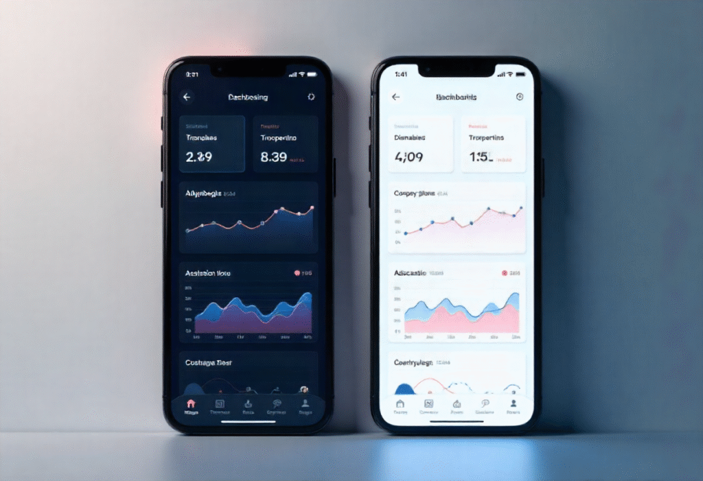
Light Mode: Bright, Familiar, and Readable
Light mode has been the default design choice for decades — from printed pages to early digital interfaces. Its dominance is rooted in familiarity and readability.
Why It Works
- High legibility: Black text on a white background offers maximum contrast, making it easy for the human eye to read for long periods.
- Natural lighting match: Daytime environments complement light mode, reducing visual strain in bright conditions.
- Perception of space: White or light backgrounds give interfaces an airy, open feeling, enhancing perceived simplicity.
When It Fails
In low-light environments, light mode can be too intense, causing glare and eye fatigue, especially during nighttime usage.
Dark Mode: Sleek, Comfortable, and Energy-Saving
Dark mode gained popularity with the rise of OLED screens and modern minimalism. It’s more than just an aesthetic — it’s a scientifically backed choice in certain contexts.
👁️ Why It Works
- Reduced eye strain in low light: Dark backgrounds with light text are easier on the eyes in dim conditions.
- Energy efficiency: On OLED and AMOLED screens, black pixels consume less power, extending battery life.
- Modern aesthetics: Dark interfaces feel sleek and immersive, offering a cinematic and premium experience.
When It Fails
Dark mode can decrease readability in well-lit environments and cause halation — a visual effect where white text appears to “glow” against dark backgrounds, reducing clarity.
The Psychology of Perception
Our eyes and brains react differently to brightness levels.
- Light mode stimulates alertness and mirrors natural daylight, promoting focus and productivity.
- Dark mode triggers melatonin release, aligning with our circadian rhythm, making it suitable for night use or relaxation.
In short:
Use light mode for work and focus; use dark mode for comfort and rest.
The UX Perspective: User Choice Wins
The real answer isn’t which mode is better — it’s offering users the choice. Adaptive interfaces that respond to system preferences or time of day create the best experience.
Best Practices for Designers
- Maintain sufficient color contrast in both modes (WCAG-compliant).
- Avoid pure black (#000000); use dark grays for comfort.
- Re-test brand colors — saturation behaves differently on dark backgrounds.
- Let users toggle modes easily or sync with system settings.
The Future: Dynamic Design Systems
With modern tools like Figma variables and design tokens, designers can build responsive systems that automatically adjust color themes. The future of UI isn’t just light or dark — it’s context-aware, adapting to users, devices, and environments.
Final Thoughts
Dark and light modes are more than just trends — they reflect how design meets human behavior and biology. Great UX design embraces both, empowering users to choose how they interact with digital experiences.


