
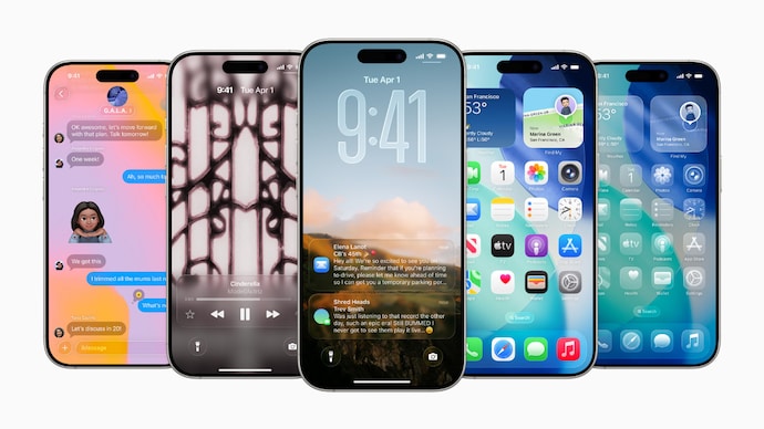
When Apple unveiled its bold new Liquid Glass interface with the launch of iOS 26, it was meant to symbolize clarity, fluidity, and next-generation interaction. Buttons shimmered. Menus floated. Animations flowed seamlessly as users navigated through apps — marking the biggest iPhone design overhaul since iOS 7’s flat redesign in 2013.
But instead of universal praise, Apple faced a wave of backlash from users and designers alike. Many found the new translucent, animated layers visually distracting, resource-intensive, and even detrimental to accessibility.
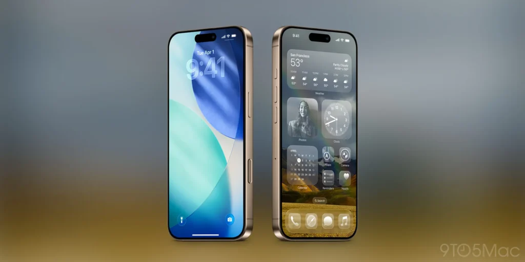
Now, with iOS 26.1, Apple is listening. The company has introduced a new “Tinted” option that lets users tone down the Liquid Glass look, restoring the calm and contrast that many felt was missing.

What Is Apple’s Liquid Glass UI?
Liquid Glass is Apple’s most ambitious design experiment in years. The company sought to unify design language across devices — from the iPhone to the Vision Pro — making digital surfaces feel alive and reactive.
Key features include:
- Translucent panels that subtly reveal app layers beneath
- Dynamic lighting and reflections that respond to motion and orientation
- Fluid animations that blur the boundary between apps and operating system
Apple described Liquid Glass as “a design that breathes, bends, and responds like a living material.” But for many users, it felt like the interface was doing too much.
The Backlash: When Design Meets Reality
Following the rollout of iOS 26, feedback flooded social platforms and developer forums.
- Accessibility advocates argued that the transparency effects made reading and navigation harder for users with visual sensitivities.
- Developers complained that Apple’s new rendering demands increased GPU usage, affecting performance on older devices.
- Business users — especially in enterprise contexts — found the new design less practical, citing reduced focus and legibility.
In short, what Apple viewed as a design revolution, many saw as an overcorrection — prioritizing aesthetic novelty over usability.
Apple’s Response: Introducing the “Tinted” Option
The upcoming iOS 26.1 beta introduces a simple but powerful toggle:
Settings → Display & Brightness → Interface Style → Clear / Tinted
When enabled, the Tinted mode reduces transparency and adds a soft, opaque filter over Liquid Glass elements, making interface layers more distinct.
This new option effectively reintroduces contrast, improves text clarity, and reduces visual strain — without fully abandoning the Liquid Glass aesthetic.
For users who admired the motion and liveliness but wanted more control, this update strikes a practical balance between form and function.
For Developers: Why It Matters
Developers are among the most affected by Apple’s UI shifts, and this update has several implications:
- App Theming & Layering
Apps that use Apple’s system-level components (e.g., toolbars, modals, navigation bars) will automatically adapt to the user’s chosen mode. Developers should test both “Clear” and “Tinted” settings for contrast and consistency. - Performance Optimization
The Tinted mode reduces transparency rendering overhead. This may improve GPU and battery performance on mid-range or older devices — valuable insights for app performance testing. - User Experience Testing
Developers should anticipate that users might toggle between Clear and Tinted. Ensuring UI elements adapt dynamically will be key for a seamless experience. - Design System Updates
Apple’s Human Interface Guidelines (HIG) are expected to receive updates reflecting the new customization approach — signaling a broader move toward user-controlled design dynamics.
For Business Leaders: The Bigger Picture
While this may seem like a cosmetic tweak, Apple’s move is a case study in adaptive design governance — and a signal to business leaders in the tech ecosystem.
- Listening to feedback early: Apple’s rapid course correction (just months after the iOS 26 launch) shows an evolving responsiveness to community sentiment.
- Design as differentiation: The company continues to push interface design as a competitive advantage — a reminder that experience is as critical as functionality.
- Platform continuity: The coherence between iPhone, iPad, Mac, and Vision Pro design philosophies reinforces Apple’s integrated ecosystem play — vital for brand and developer continuity.
For product owners and UX strategists, this moment underscores the value of user-informed iteration and customizability as a trust-builder.
Looking Ahead: The Future of Apple Design Philosophy
Apple’s introduction of Liquid Glass — and its swift refinement — highlights an ongoing shift in its design ethos:
- From minimalism to materiality: Design is moving from flat icons to interactive depth.
- From control to customization: Users increasingly demand control over their visual environment.
- From uniformity to personalization: Apple’s design language is evolving toward adaptive UI — where users can shape their digital experience.
If iOS 7 defined the modern era of flat design, iOS 26 and beyond may define the era of adaptive fluid design — one that lives between beauty and practicality.
Conclusion: A Transparent Lesson in Listening
Apple’s Liquid Glass experiment reflects both the ambition and the risk of radical innovation. The new “Tinted” option in iOS 26.1 isn’t merely a cosmetic patch — it’s a lesson in iterative design, user-centric evolution, and brand agility.
For developers, it’s time to test and adapt.
For business leaders, it’s a masterclass in responding to customer sentiment.
And for users, it’s a reminder that — even in Apple’s world — you still have the power to shape your experience.