
Every designer loves a good transformation story — especially when a dull, cluttered interface turns into something clean, intuitive, and delightful. In this post, I’ll walk you through how thoughtful design choices can completely change the way users experience an app.
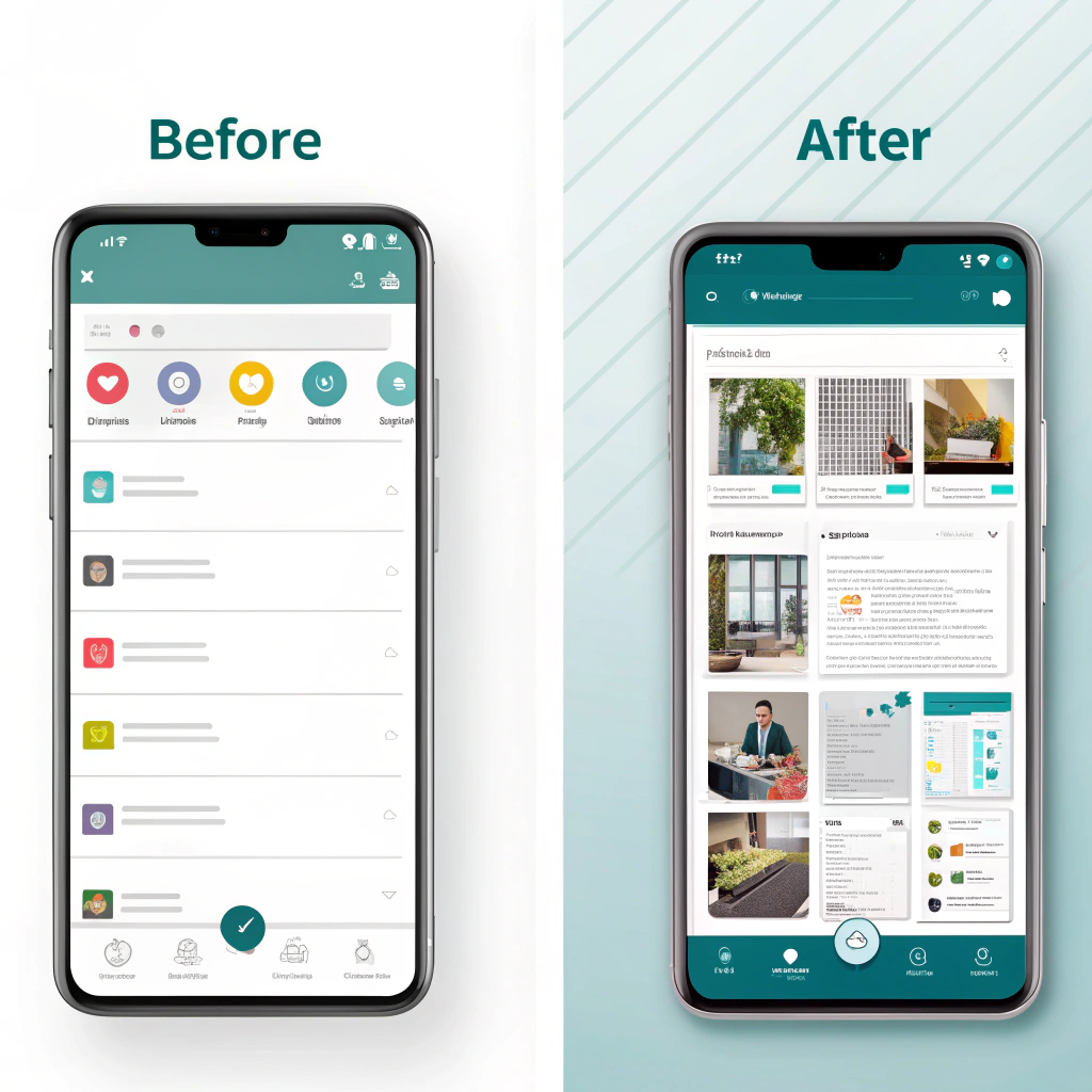
The “Before” — A Functional but Forgettable Design
At first glance, the old interface worked. Buttons were there, navigation existed, and the app did its job.
But that was the problem — it just worked, without connecting to users.
Common issues included:
- Crowded layout: Too many elements competing for attention.
- Poor hierarchy: Users didn’t know where to look first.
- Bland colors and typography: No personality or emotion.
- Low usability: Important actions were buried or unclear.
This is the kind of interface users forget — or worse, abandon.
The “After” — Simple, Smart, and User-Centric
The redesign focused on one core idea: clarity with personality.
Here’s what changed:
- Clean layout: Added white space and aligned elements consistently.
- Color with purpose: Introduced a modern palette that reflects brand energy.
- Visual hierarchy: Highlighted key actions and information.
- Consistent components: Buttons, icons, and text styles now follow a design system.
- Microinteractions: Subtle animations add delight and feedback.
The result? An interface that feels fresh, focused, and functional.
Design Thinking Behind the Transformation
Every change was backed by research and intent:
- User feedback: We analyzed pain points and simplified navigation.
- Accessibility: Improved contrast, font sizes, and touch targets.
- Consistency: Built reusable components for scalability.
- Visual storytelling: Added small design details that make the app feel alive.
This wasn’t just a visual upgrade — it was a usability evolution.
Key Takeaways
- Design isn’t decoration — it’s problem-solving.
- Whitespace = clarity. Don’t be afraid of simplicity.
- Consistency builds trust.
- A good redesign should feel natural, not new.
Final Thoughts
The “before” version did its job.
The “after” version inspires interaction.
That’s the magic of great UI/UX — it turns something ordinary into something memorable.
If you’re working on a redesign, remember: every pixel should serve a purpose. Because when design and function align, users don’t just use your app — they enjoy it.


